
Branding + Logo Redesign
Client: Cabomba Content Pty(Ltd)
Year: 2024
Cabomba Content is a digital marketing agency specialising in content stratagies and social media management for baby and parenting brands.
Visionary and founder of Cabomba Content, Rita, has a deep passion for anything related to pregnancy, baby care, and childcare. She wanted her branding to appeal to the bright,
vibrant and energetic world that is babies and kids.
Software:



The first thing I do for all my branding clients is establish a style. This creates the overall look and feel that I will use to design the rest of their branding.
It will also be reflected and repeated across all their online platforms and social media pages, and physical products, making them recognisable as a brand.
Rita already had some idea of what she wanted for her style. She also had colours in mind. We just needed to find the exact look that would appeal to her and most importantly
her clients. Cabomba mostly works with children and baby brands so the style needed to reflect the fun and energy that kids naturally have. The vibrant and playful style illustrated
on this page is the result.

Next, was the logo. Cabomba already had a basic logo but it no longer matched their vibrant new style. It was time for a makeover. Their new logo is fun, fresh and suits their new style much better!
Hover or click the logo!
Hover or click the logo!
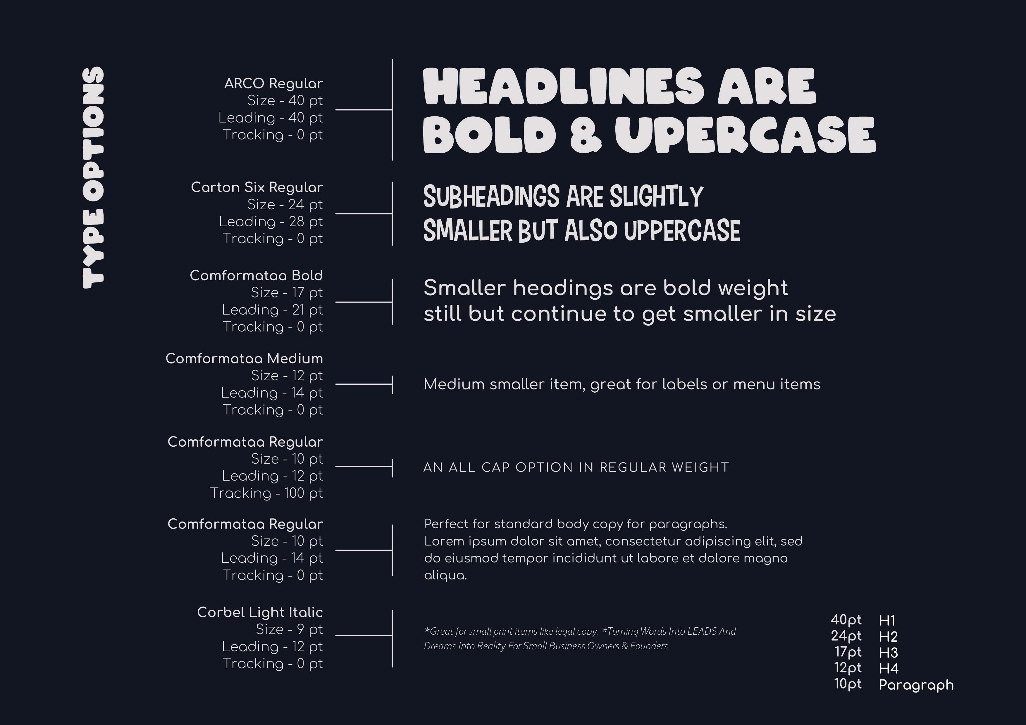
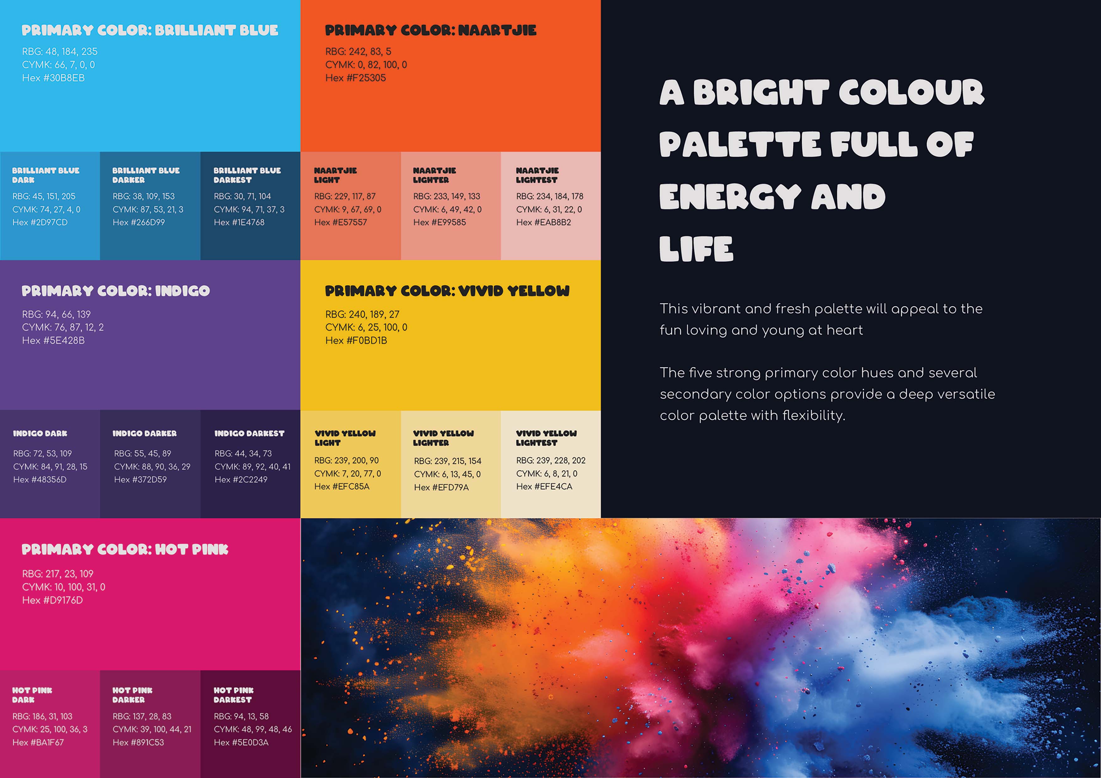
After the logo and styling had been nailed down it was time to perfect and fine tune Cabomba's colour palette and typography. These not only help to enhance and compliment the brands already bold style, they also help guide any future branding or content that will be done. Should another designer or web developer work on Cabomba's content they will know exactly which colours to use, how to use the fonts and how to incorporate the branding into all elements in order to keep things consistent and recognisable across all platforms.
Seeing as Cabomba offers digital services they didn't need any brand assets or designs for physical products.
They had already incorporated a cute little owl in their old logo so I decided to have some fun with this concept and take it a little further. Thus Owlie was born!
He has several versions and expressions and, him and his family and friends play around on Cabomba's social platforms and website.
I also create weekly graphics for Cabomba's social media platforms. If you'd like to see how this branding is being applied to Cabomba Content in the real world you can check out any of their online platforms:
